
Weekend thoughts
No penny for my thoughts

This is a weekly digest of unassociated pictures (graphs mostly) I saw during the week. Not much context is given.
For daily digests: https://no1sdailydigest.substack.com/archive
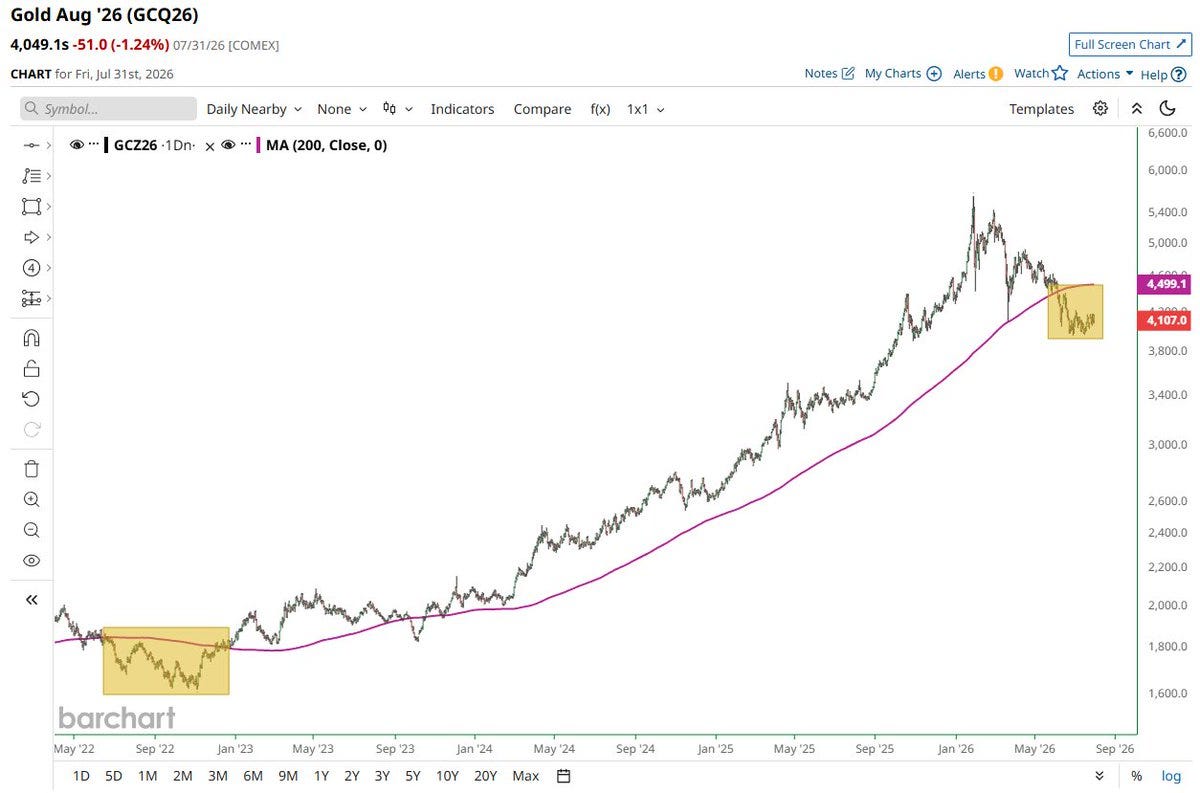
Gold below its 200-day MA for 39 straight days, longest since 2022:
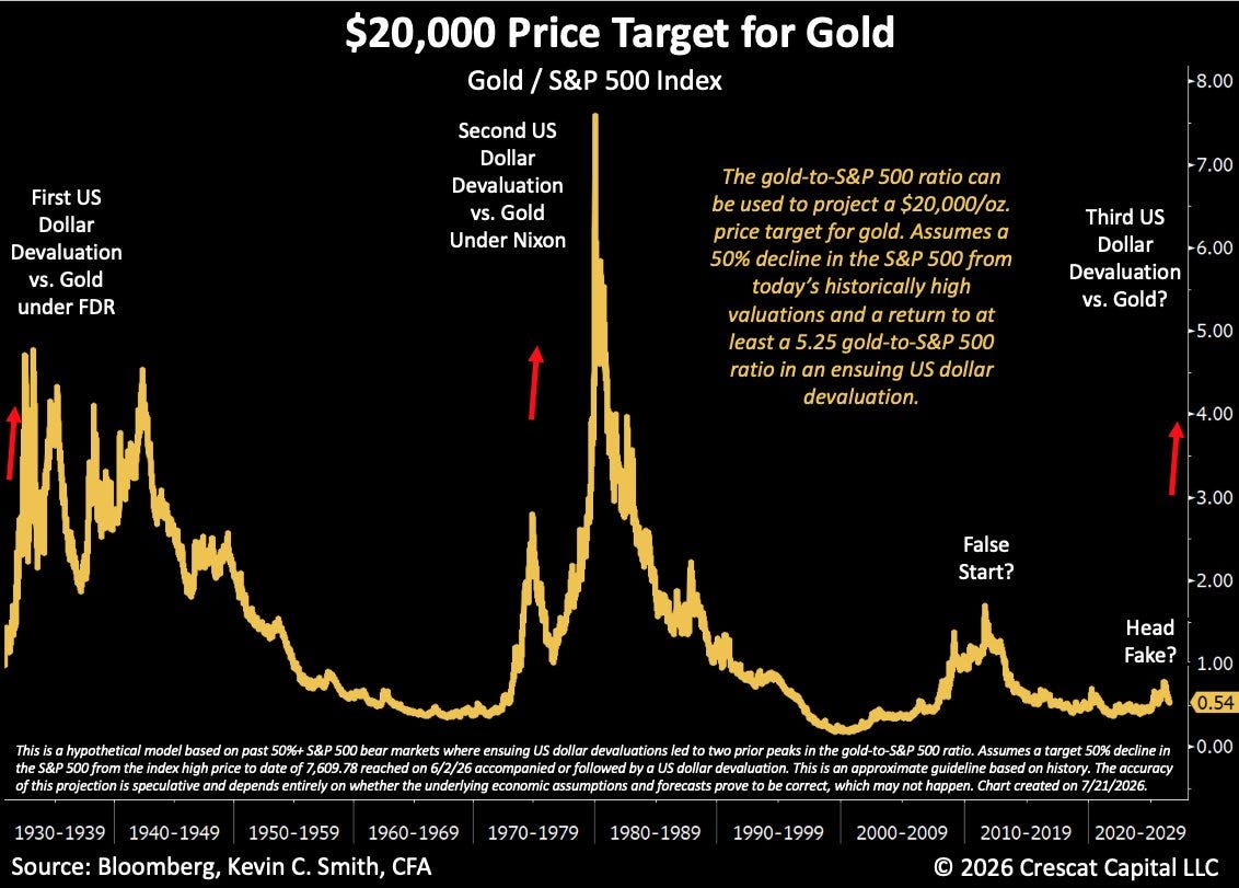
$20,000 gold price target (gold-to-S&P ratio model):
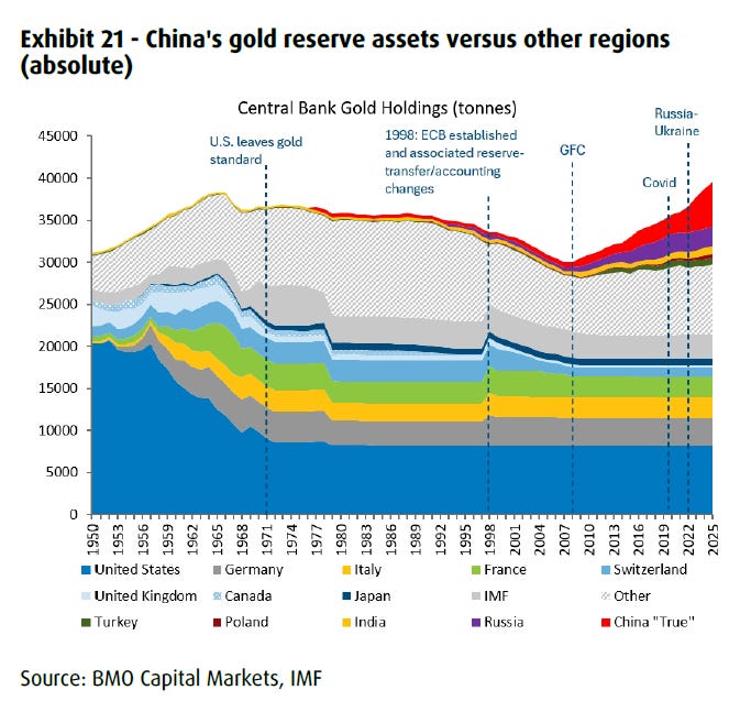
Central bank gold holdings by country since 1950:
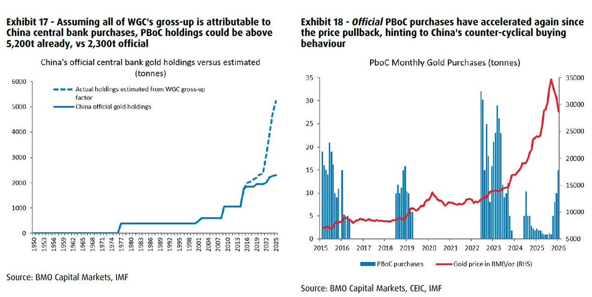
PBoC gold: ~5,200t estimated vs 2,300t official:
China's overseas gold M&A: $18B since 2004:

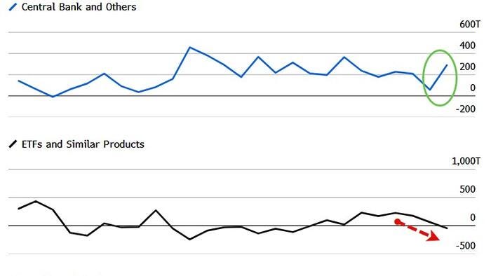
Central banks vs ETFs filling the gold demand gap:
Global money supply vs gold:

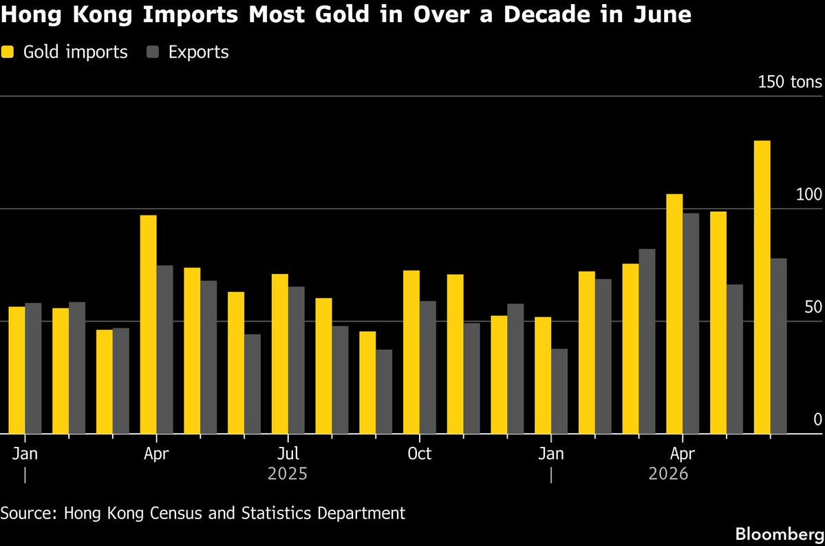
Hong Kong gold imports 🚀, highest in over a decade:
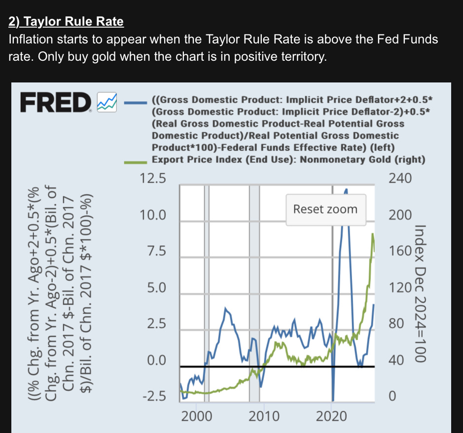
Taylor Rule rate vs Fed Funds (only buy gold when positive):
Silver psychology chart:

S&P 500 priced in silver: 123 oz/share:


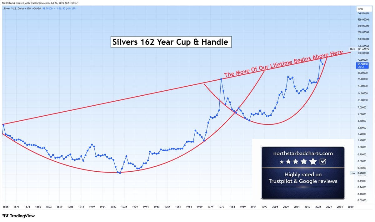
Silver's 162-year cup & handle:
Silver's explosion past $100 vs S&P 500:


10-2 yield curve breakout:


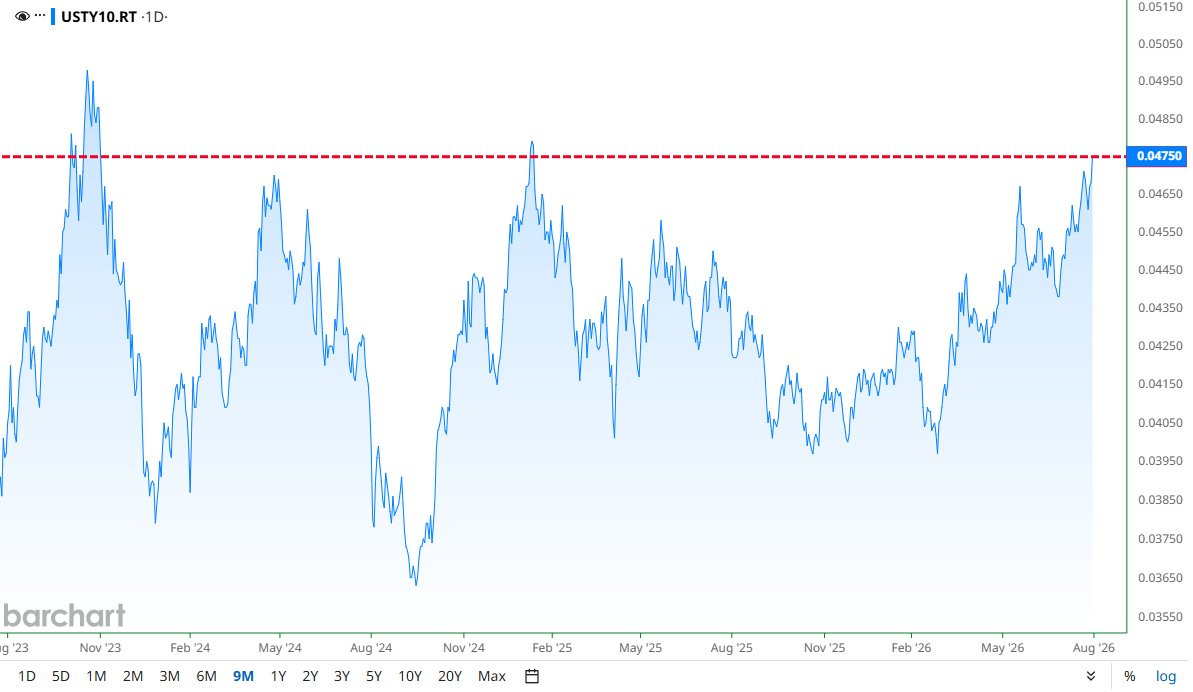
10-year Treasury yield 🚀 4.75%, highest in 18 months:
30-year Treasury yield:

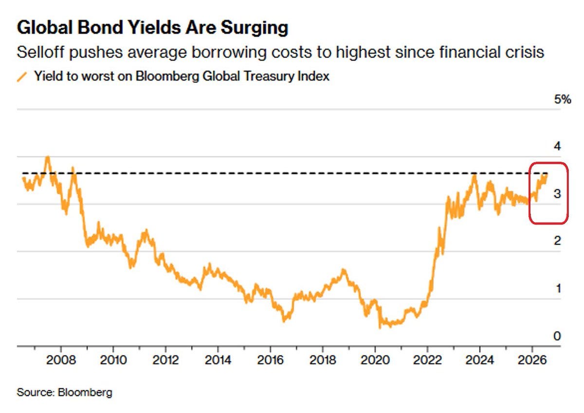
Global bond yields, highest since 2008:
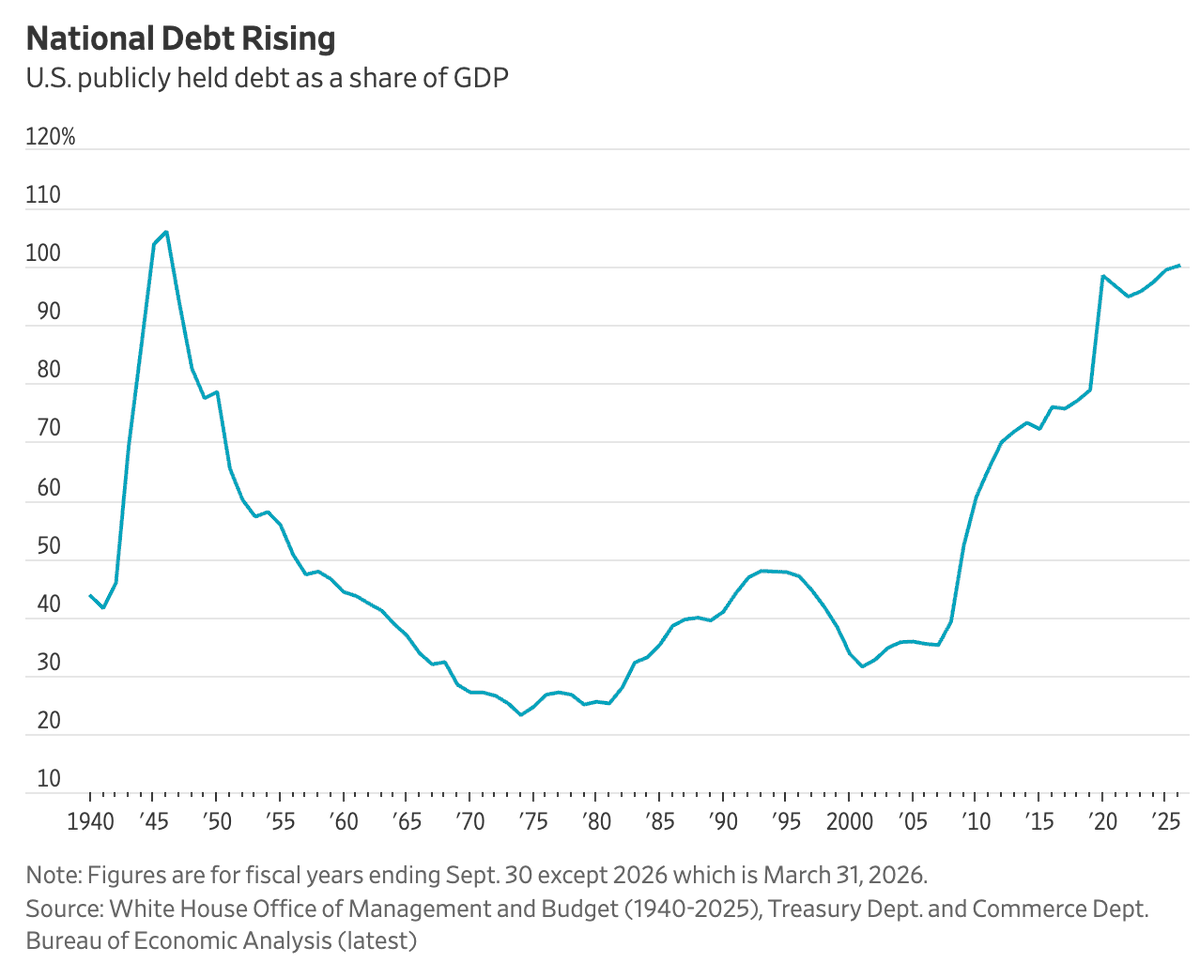
US debt tops 100% of GDP, first time since WWII (guess we need a sequel):
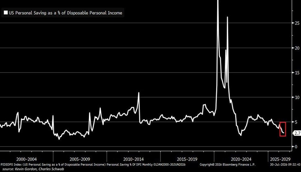
US personal savings rate: 2.7%, lowest since 2022:
US CPI: 64 straight months above 2%:

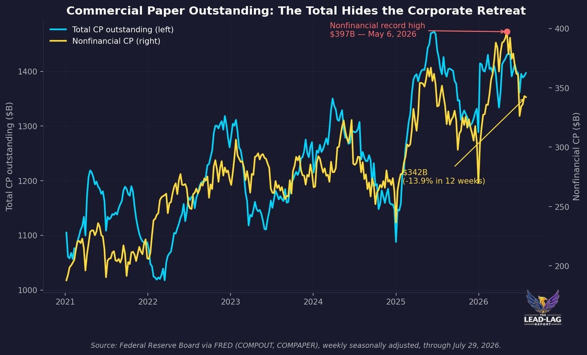
Nonfinancial commercial paper: record $397B, then -$55B:
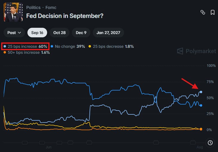
Market prices a record 60% odds of a September hike:
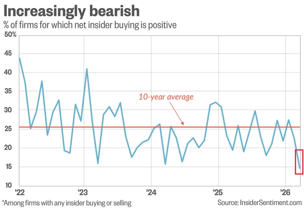
Corporate insider buying near a 21-year low:
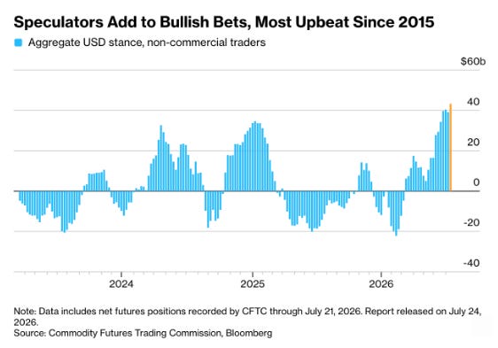
Speculators most bullish on the dollar since 2015:
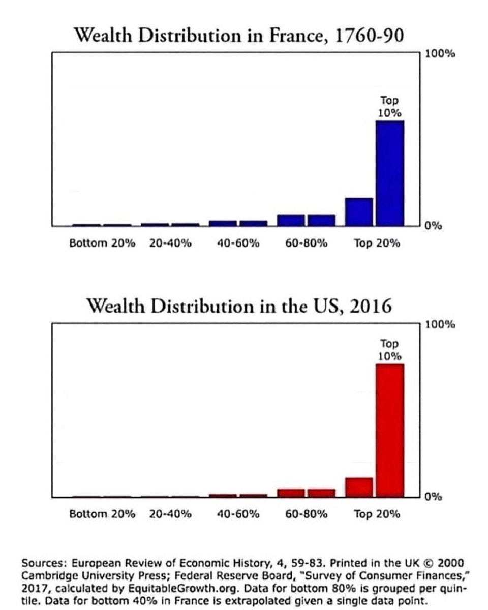
Wealth distribution: France 1789 vs US today (we all know what happened):
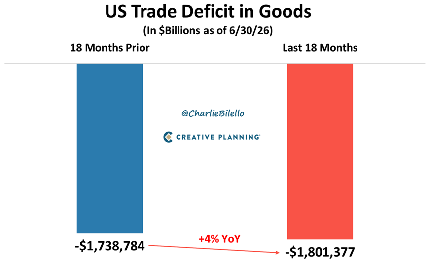
US goods trade deficit widened 4% despite tariffs:
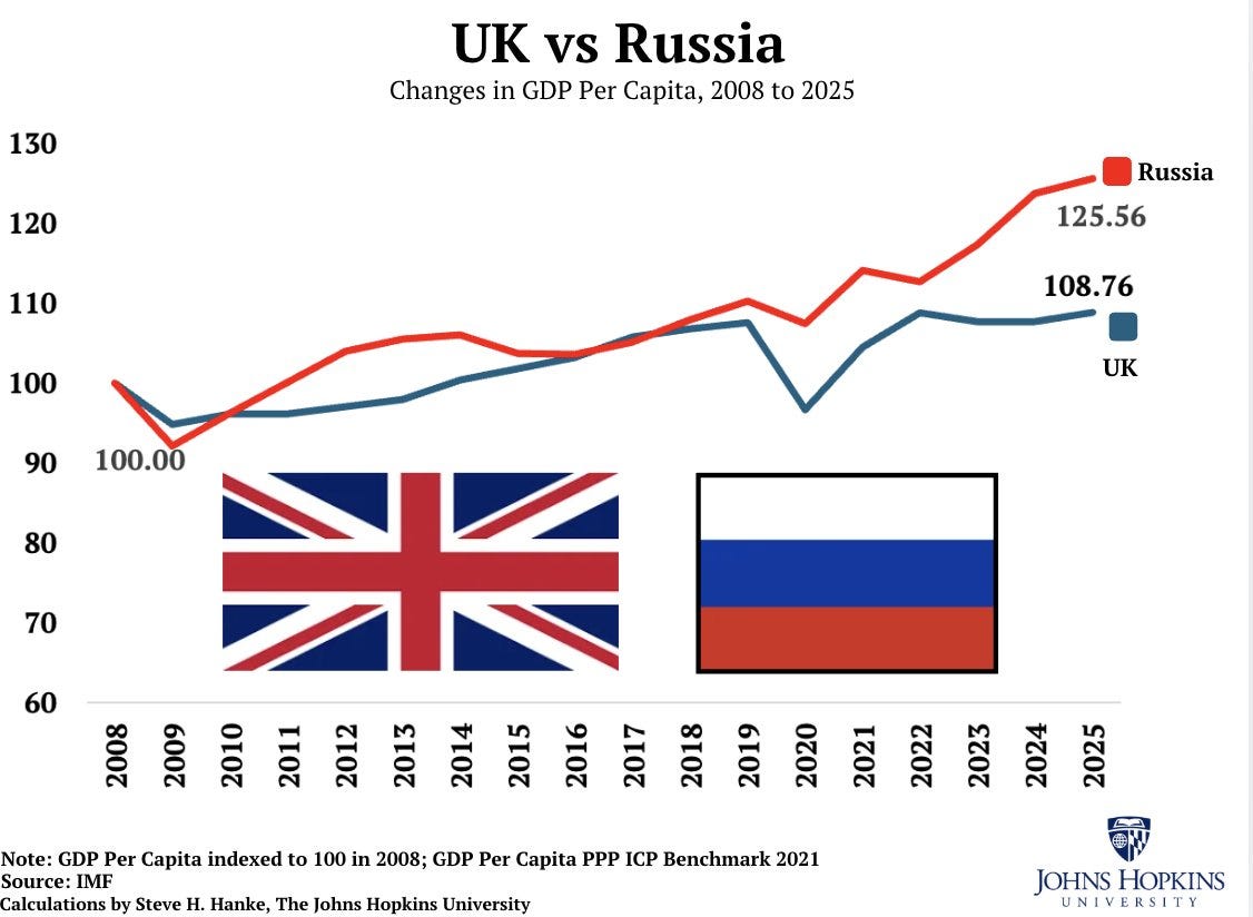
UK vs Russia GDP per capita since 2008:
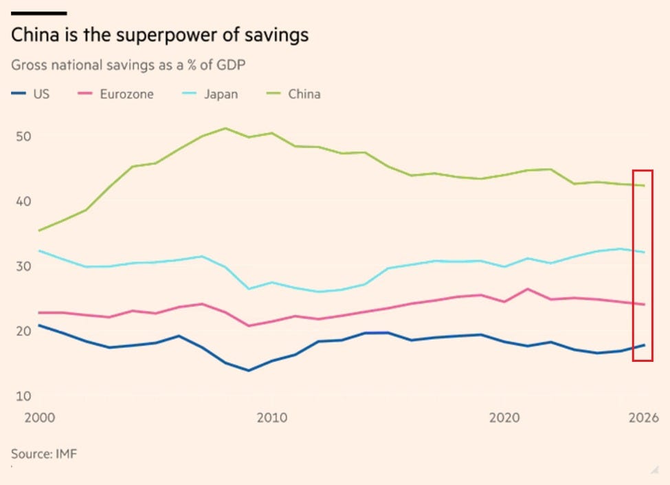
China's gross national savings: 43% of GDP:
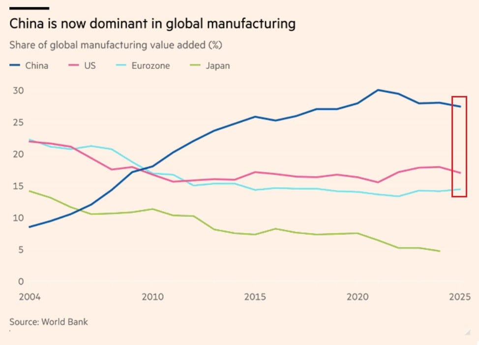
China's share of global manufacturing: ~28%:
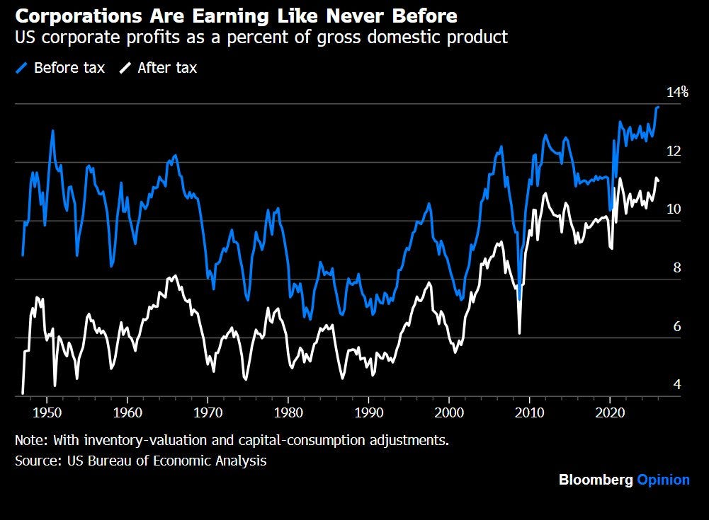
US corporate profits at record 14% of GDP:
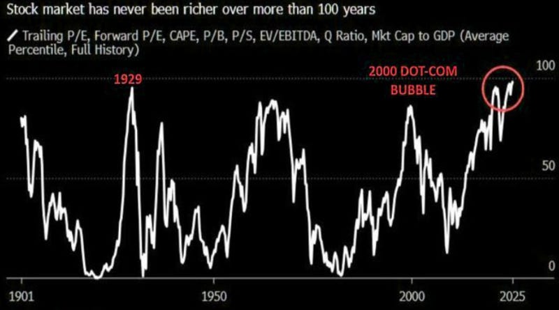
Stock valuations highest in market history:
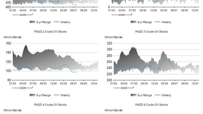
US crude inventories by PADD, precariously low:
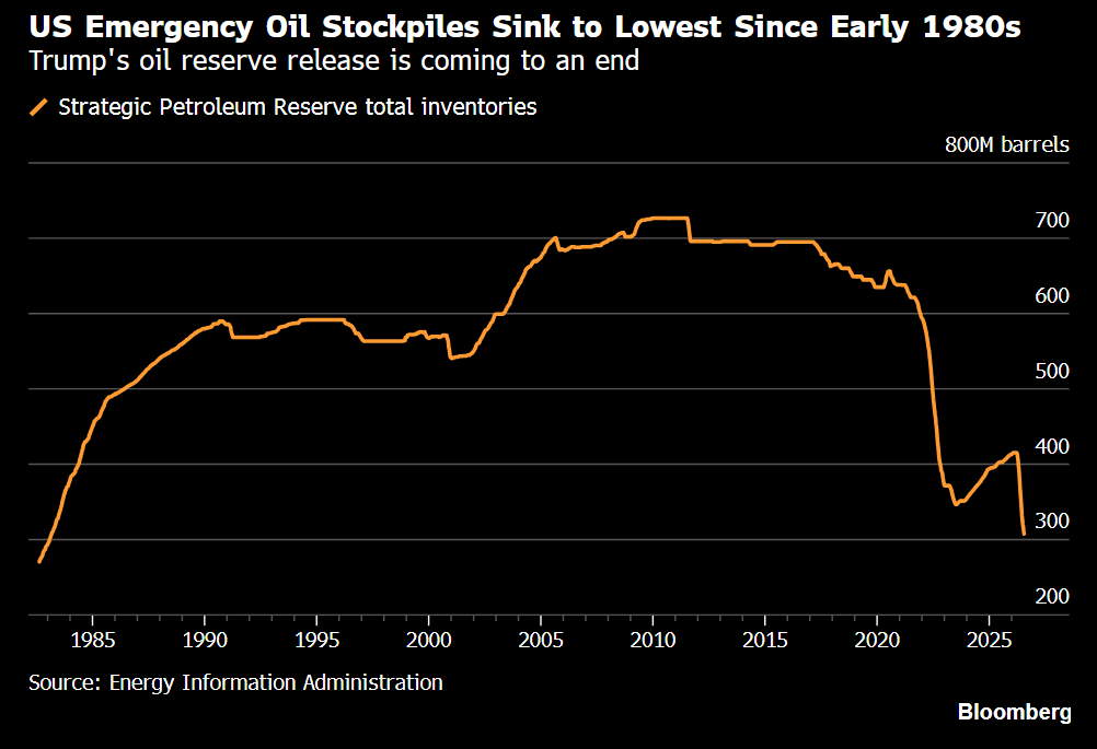
US emergency oil reserve, lowest since the early 1980s:
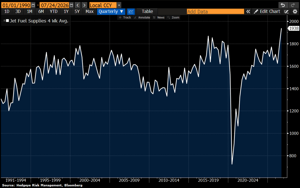
US 4-week jet fuel supply hits a record high 🤔:
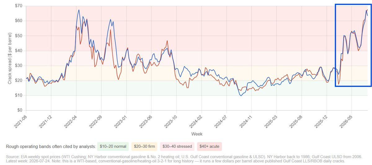
Crude oil crack spread ($/barrel):
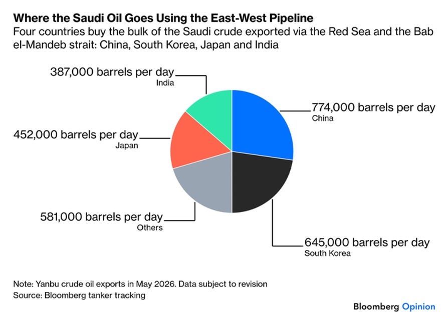
Where Saudi East-West pipeline crude goes:
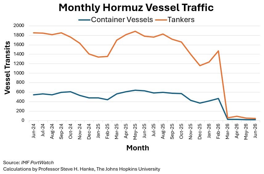
Hormuz tanker traffic collapses: 4 vs 58 a year ago:
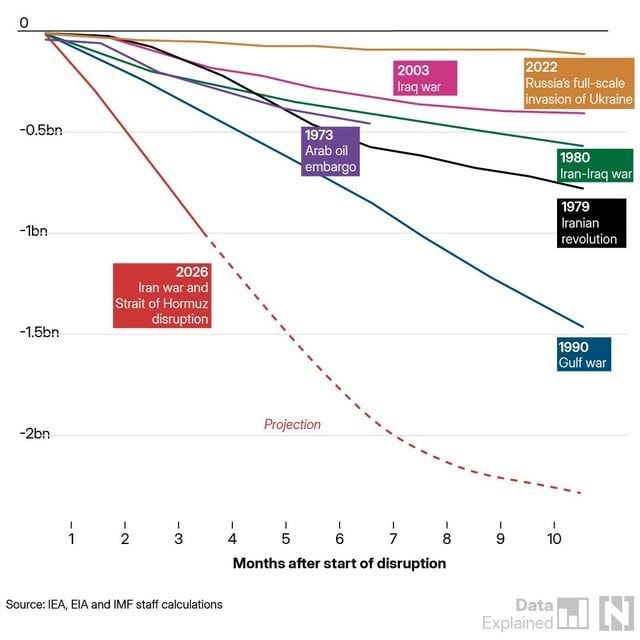
Iran war on track to be the deepest oil shock in modern history:
KOSPI's worst month in history (-33%):
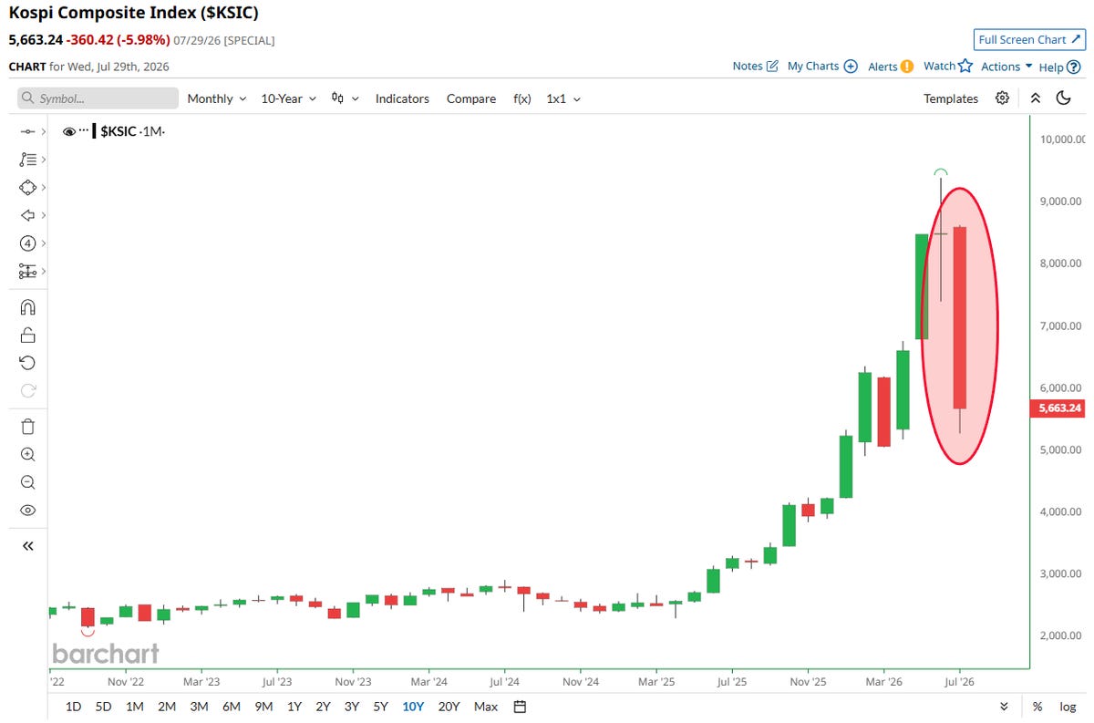
KOSPI: +50% YTD to -44% in 40 days:


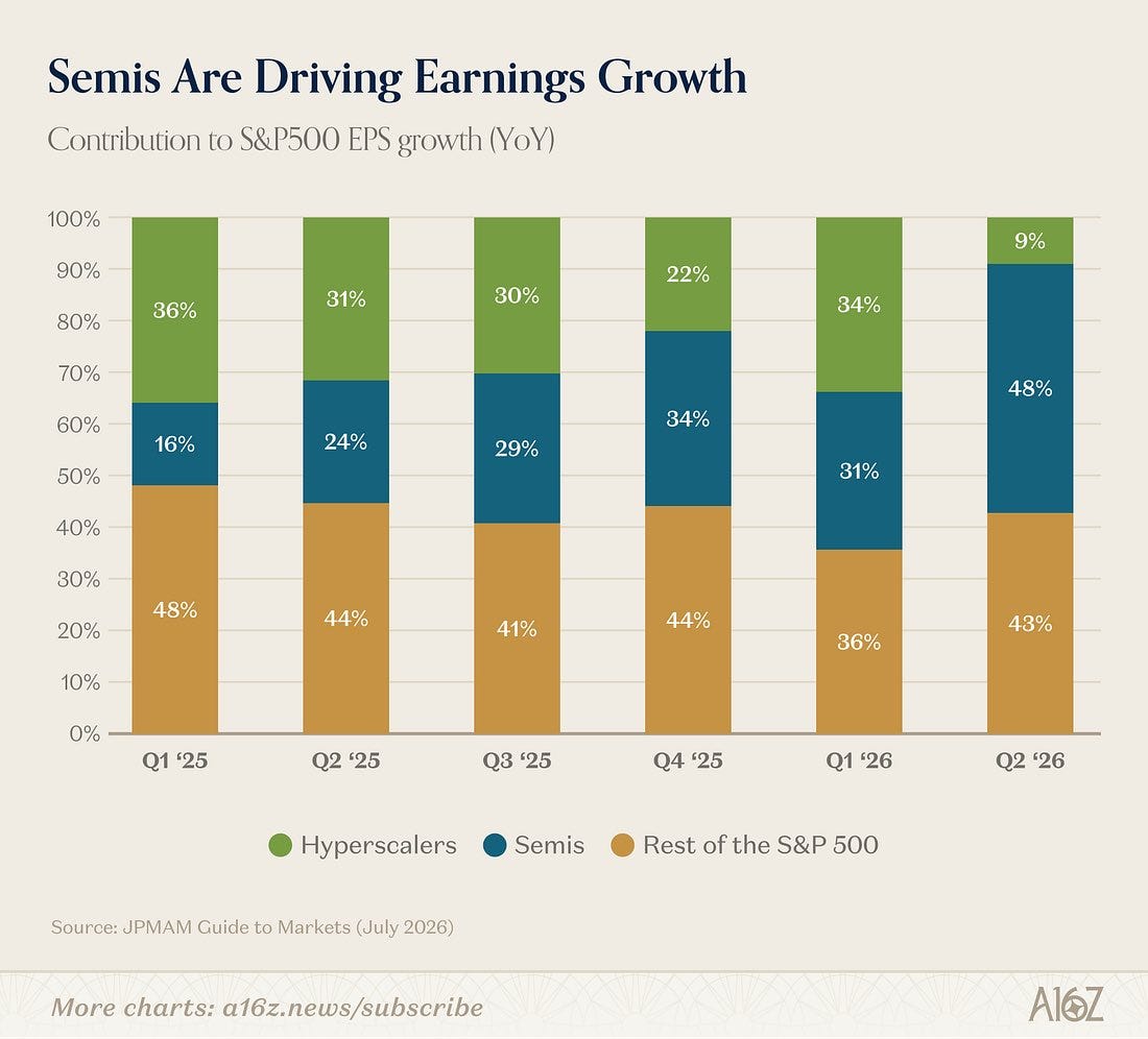
Semis: nearly half of S&P 500 earnings growth:
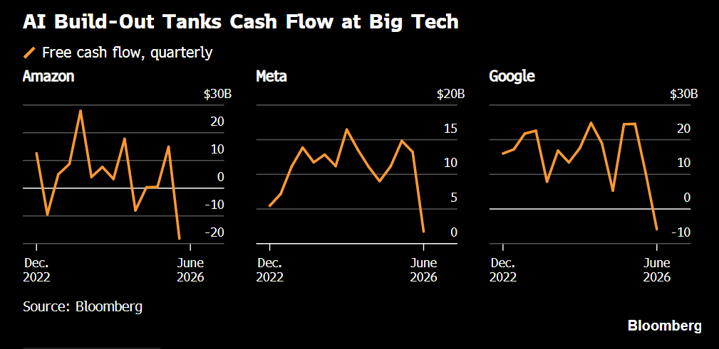
Amazon, Meta, Google free cash flow collapsing:
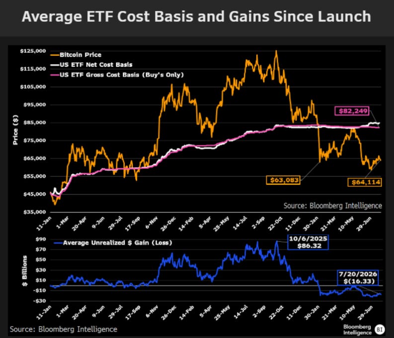
Average US Bitcoin ETF buyer now down -22%:
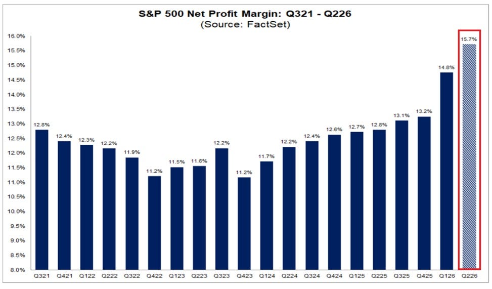
S&P 500 net profit margin: record 15.7%:
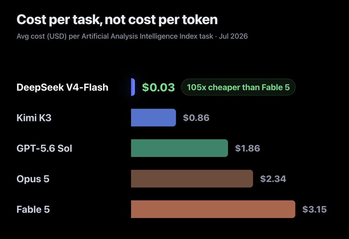
AI cost per task: DeepSeek 105x cheaper than Fable 5:

This is my last comment on the above chart I'm affixiated with - but look closely in 1998 there was a shift.
So if it goes up for some - it must go down for others in a chart absolute - correct?
So look closely in 1998 some gold was stolen from "others".
So, I'm sort of sorry to be obsessing over this one chart but if I read the colors correctly it seems Turkey's percentage has increased rapidly in recent year (dark green it is).
Might that explain why recently Israel and Greece of all places had some threatening message towards Turkey - I mean I sure as hell hope not but if you want I'll be happy to share an article on this - cause these things are connected - are they not?
Here is the article:
https://www.sott.net/article/507664-Eastern-Mediterranean-A-new-military-axis-against-Turkey
Just doing my duty.