
Weekend thoughts
No penny for my thoughts

This is a weekly digest of unassociated pictures (graphs mostly) I saw during the week. Not much context is given.
For daily digests: https://no1sdailydigest.substack.com/archive
PBOC gold reserves: 21st straight monthly add:
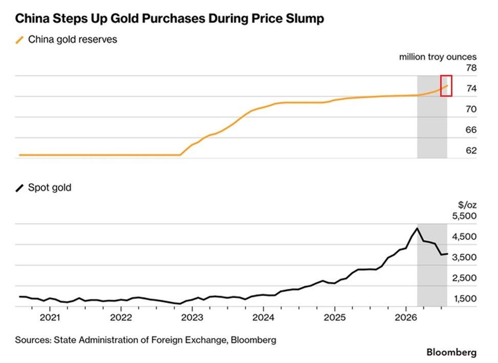
Global gold ETF accumulation: +960t in 104 weeks:
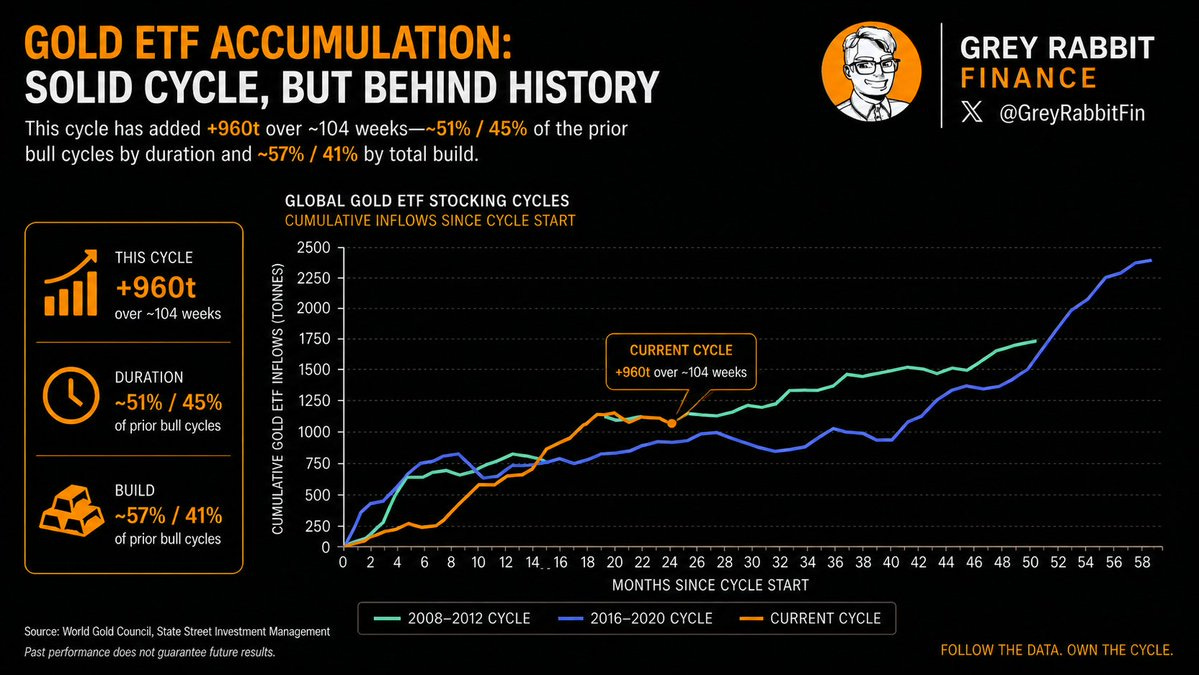
Global gold vault stock: LBMA 9,534t, COMEX 857t:
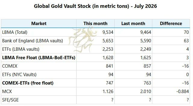
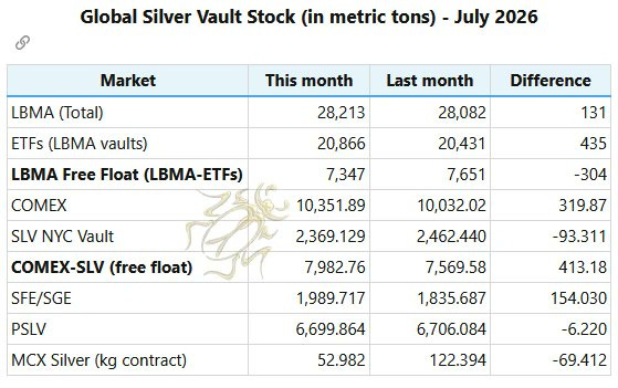
Global silver vaults: LBMA free float -304t:
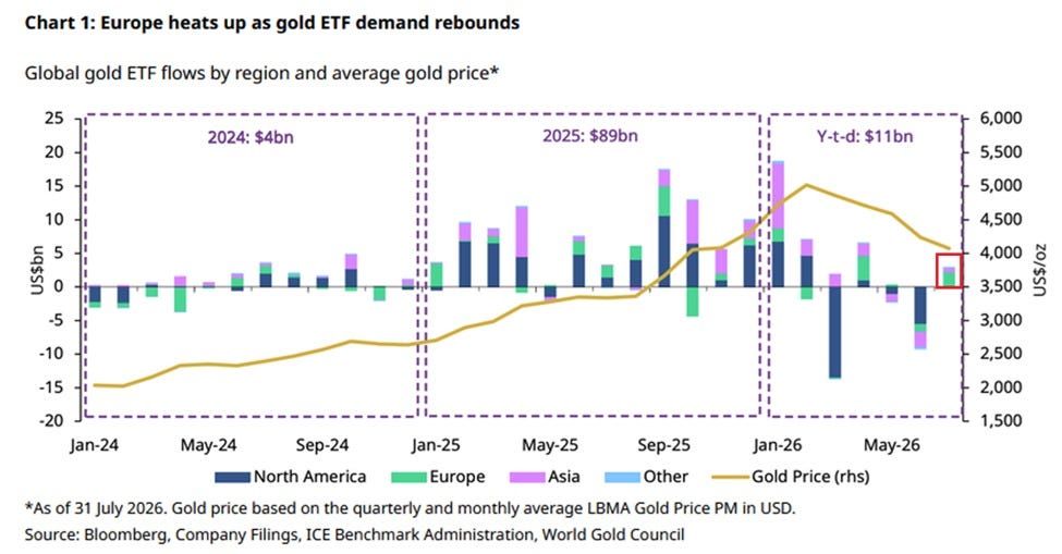
Gold ETF flows, +$3.0bn in July — Europe heats up:
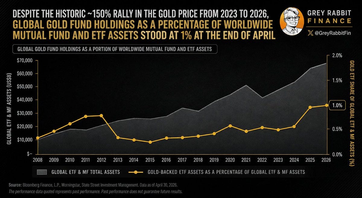
Gold funds still 1% of world fund assets:
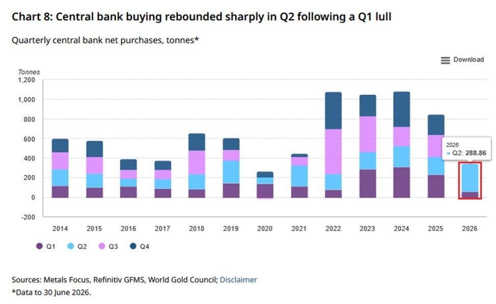
Central bank gold buying: 288.86 tonnes in Q2:
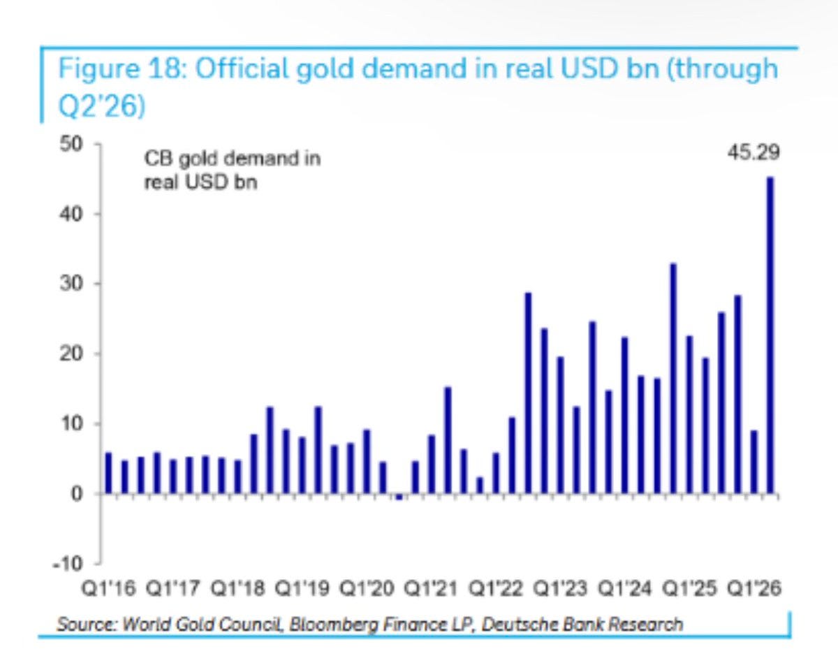
Official gold demand in real USD: $45.29bn:
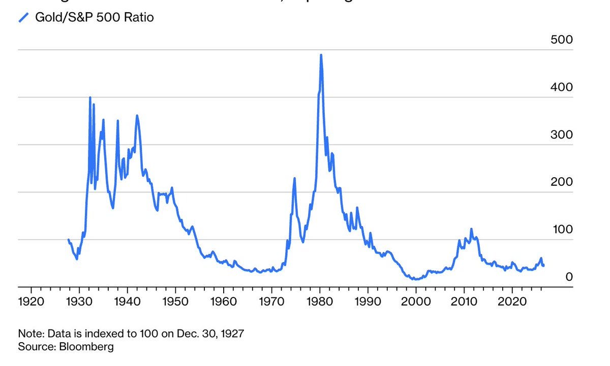
Gold/S&P 500 ratio since 1927 (“too late to buy gold”):
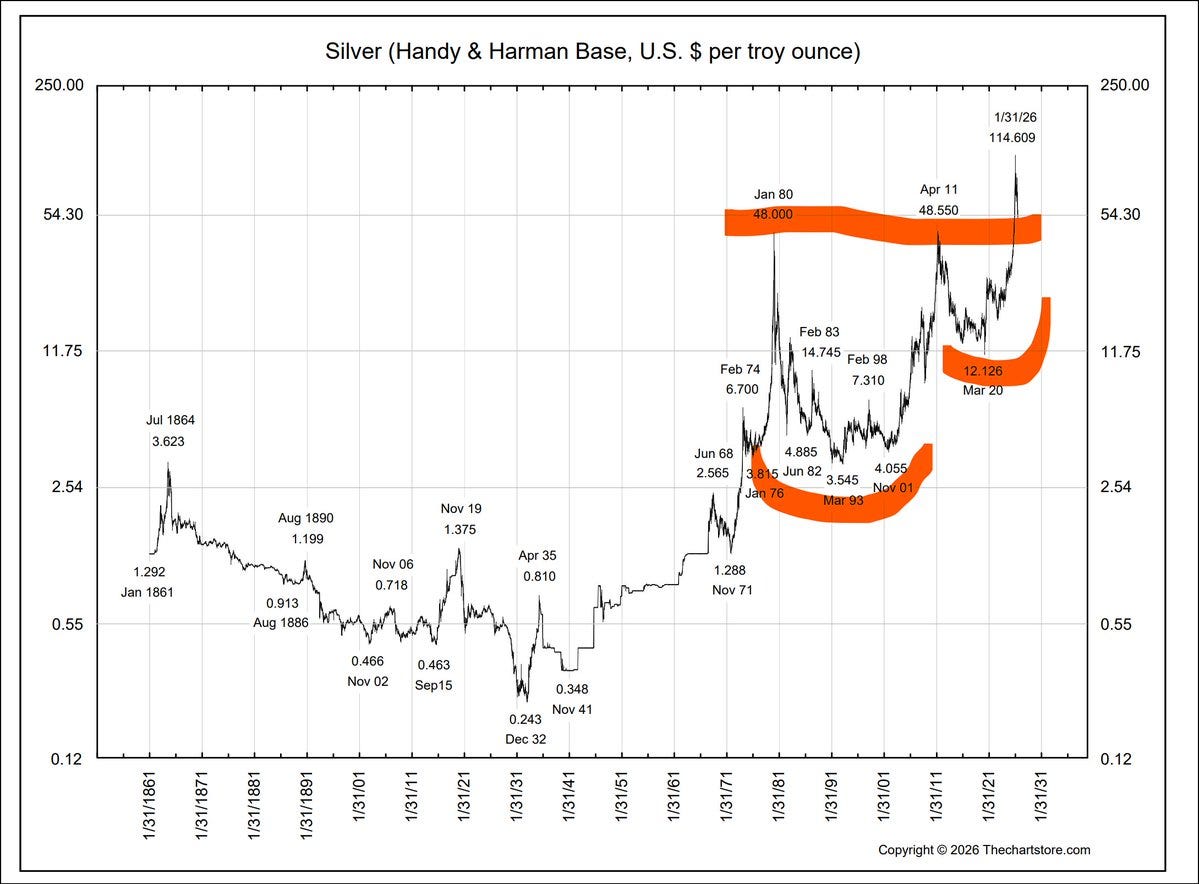
Silver since 1861: $0.12 to $54.30:
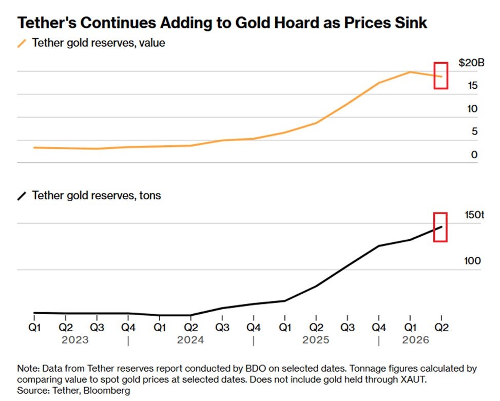
Tether's gold hoard: 146 tonnes and climbing:
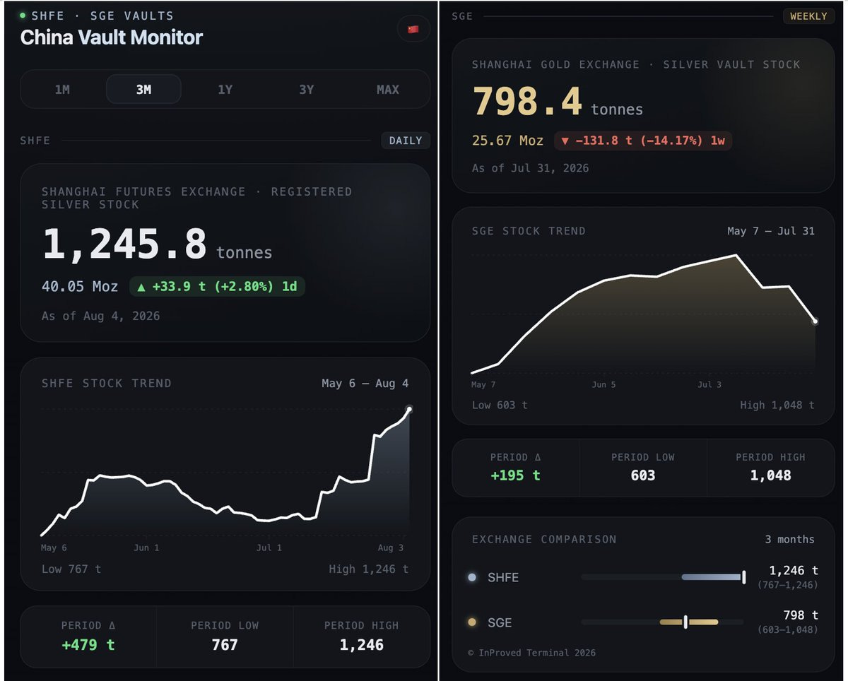
China silver vaults: SHFE 1,245.8t, SGE -14% w/w:
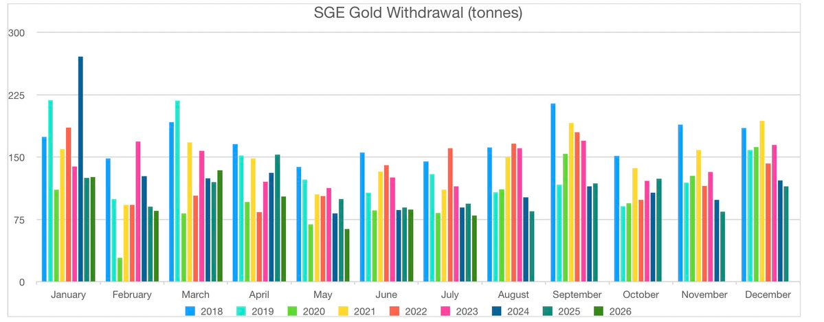
SGE gold withdrawals: 79.84 tonnes in July:
COMEX silver: only 6.5% of July deliveries actually withdrawn:


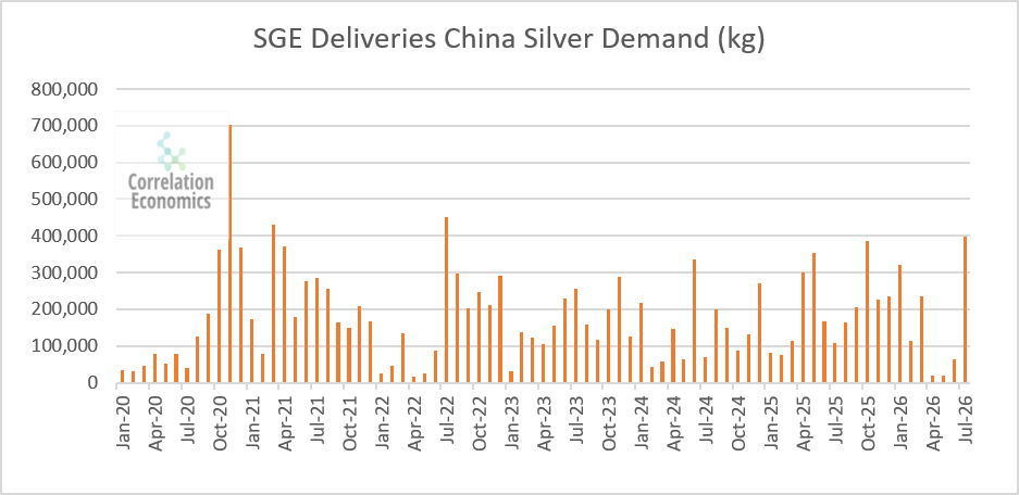
SGE silver deliveries spiking toward 800,000 kg:
London silver ETF vault stock, SLV at 12,768t:

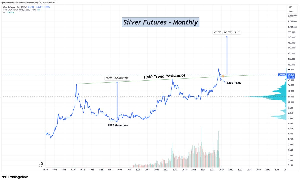
Silver's 45-year cup and handle, backtest and 🤑:
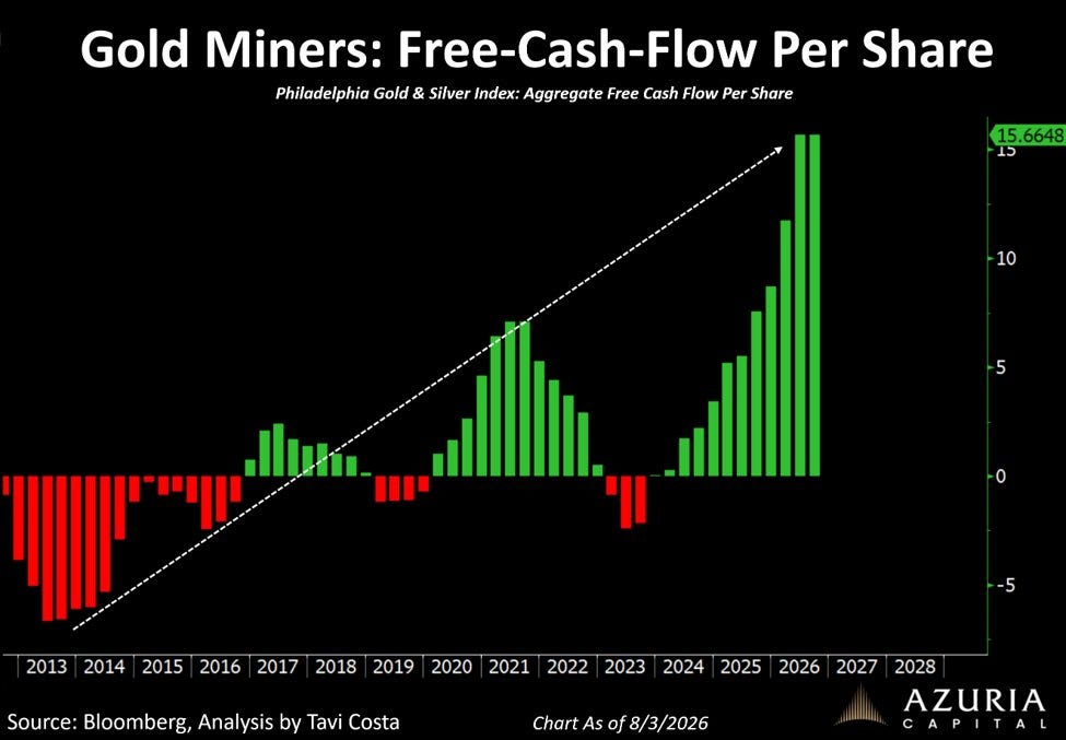
Aggregate free cash flow per share for gold miners 🤑:
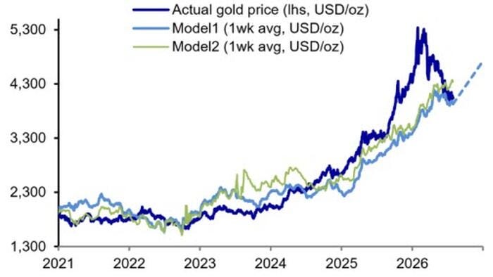
Gold vs fair-value models, $4,600 year-end:
MCX (India) vaults draining: about 5 working days of gold left:


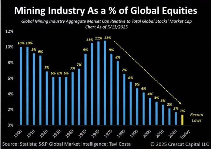
Mining as a share of global equity market cap, still near the lows:
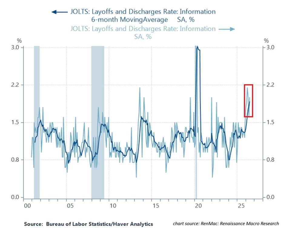
Information-sector layoff rate: 2.3%, 3rd-highest since 2020:
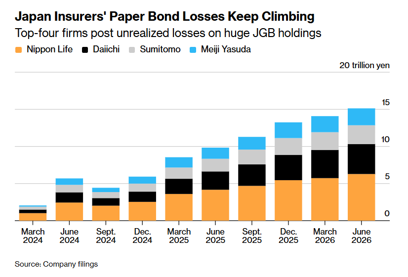
Japan's big-four life insurers: ¥15.13tn of JGB paper losses:
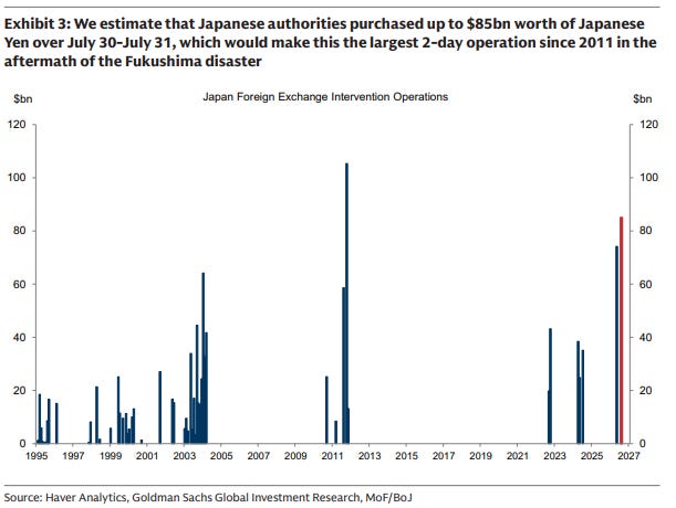
Japan's yen intervention: $85bn in two days, biggest since 2011:
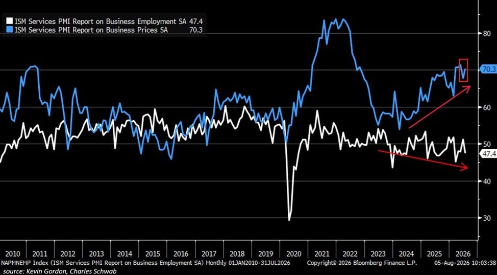
ISM services: employment 47.4, prices paid 70.3. Stagflation-shaped:
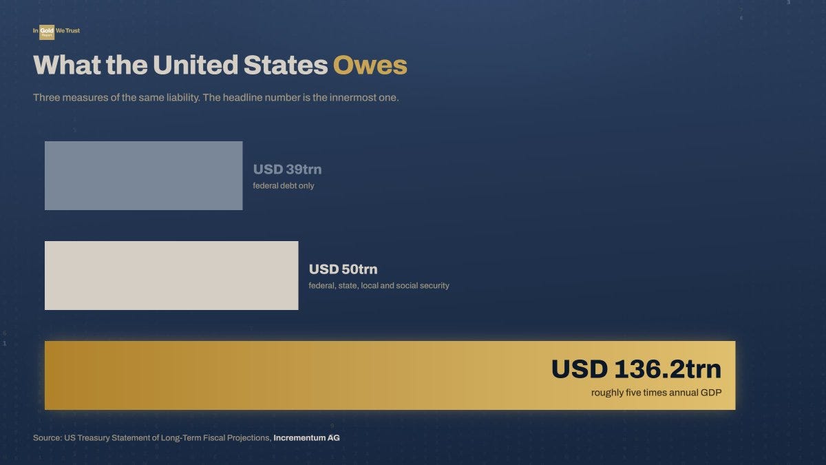
What the US actually owes: $39trn on paper, $136.2trn all-in:
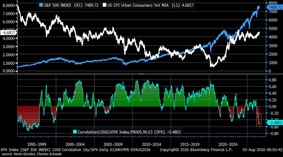
Stock-bond correlation at -0.48, most negative since 1999:
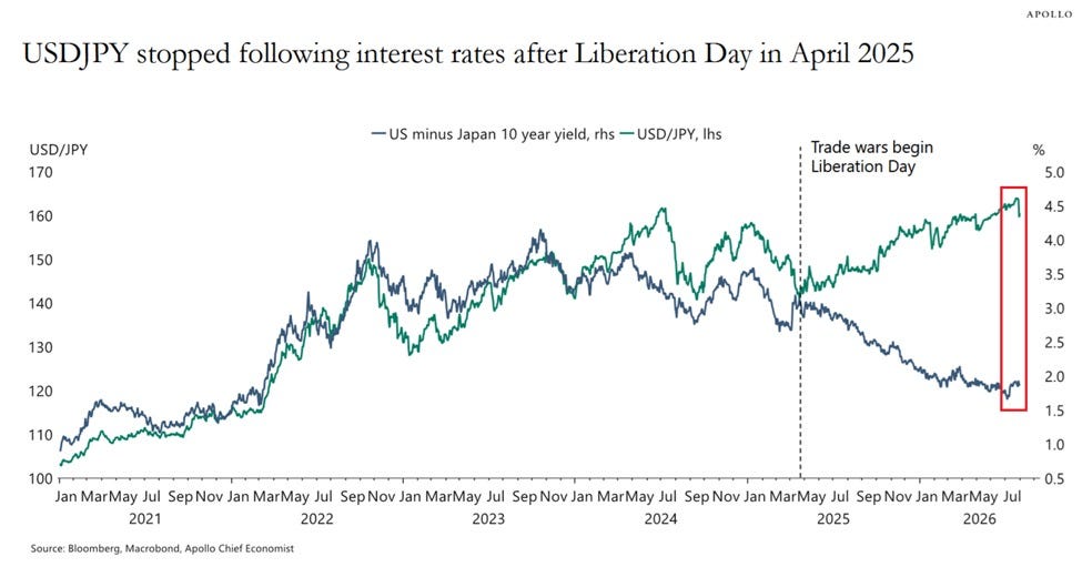
USD/JPY stopped following the US-Japan 10-year gap:
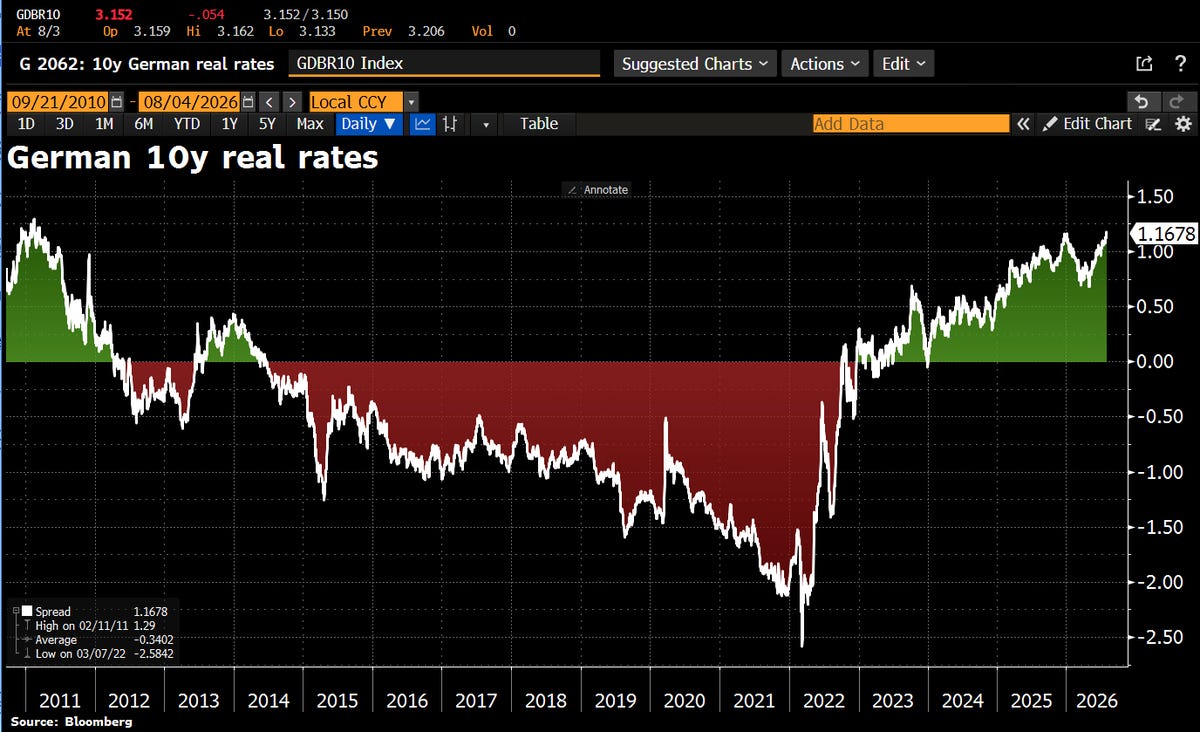
German 10-year real yield 1.17%, highest since 2011:
G10 debt/GDP vs 30-year yields, Cuckoo-land to the right top:

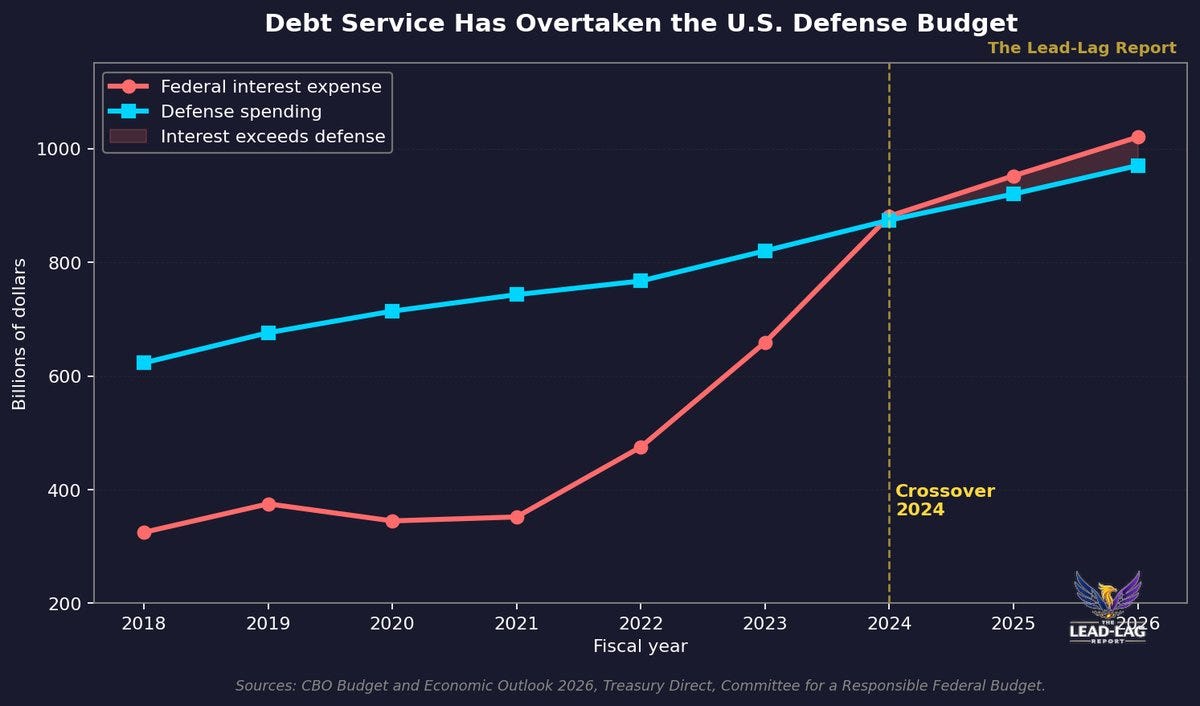
US interest expense vs defense spending, crossed in 2024:
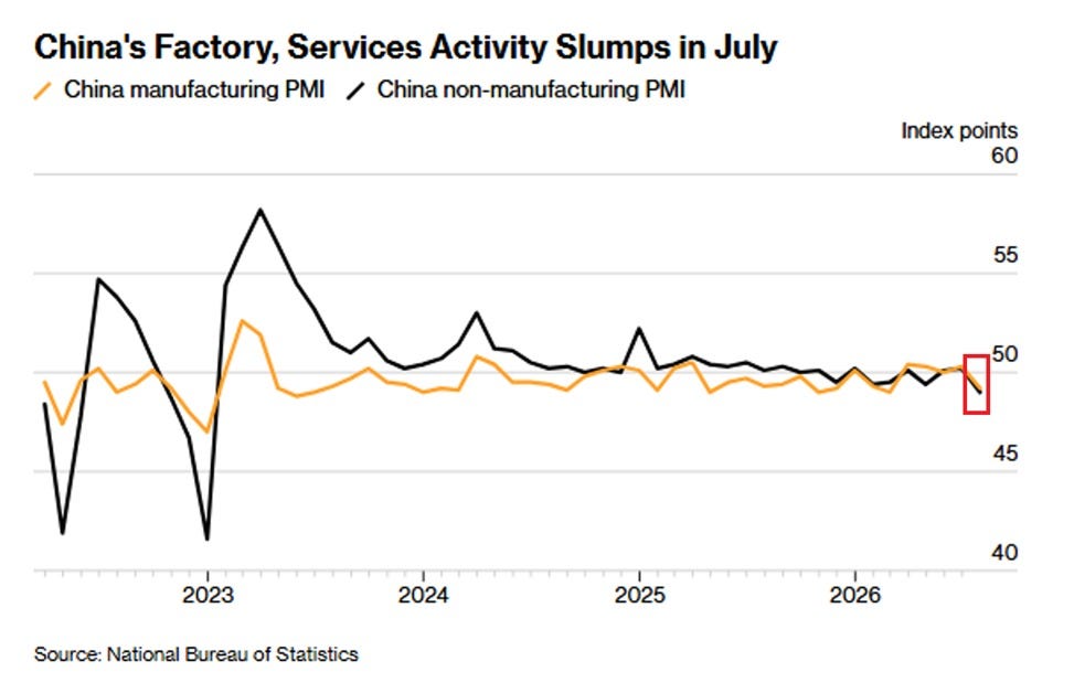
China manufacturing PMI 49.2, non-manufacturing 49.0:
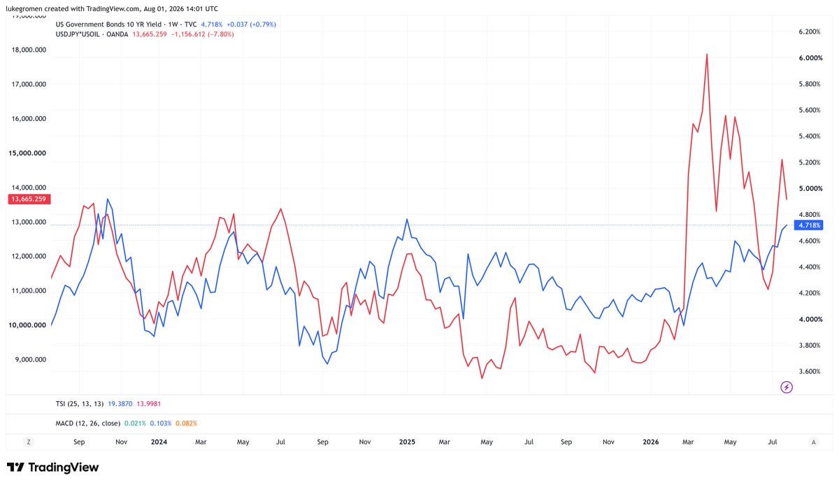
10-year UST yield vs USDJPY x oil since the BOJ dropped YCC:
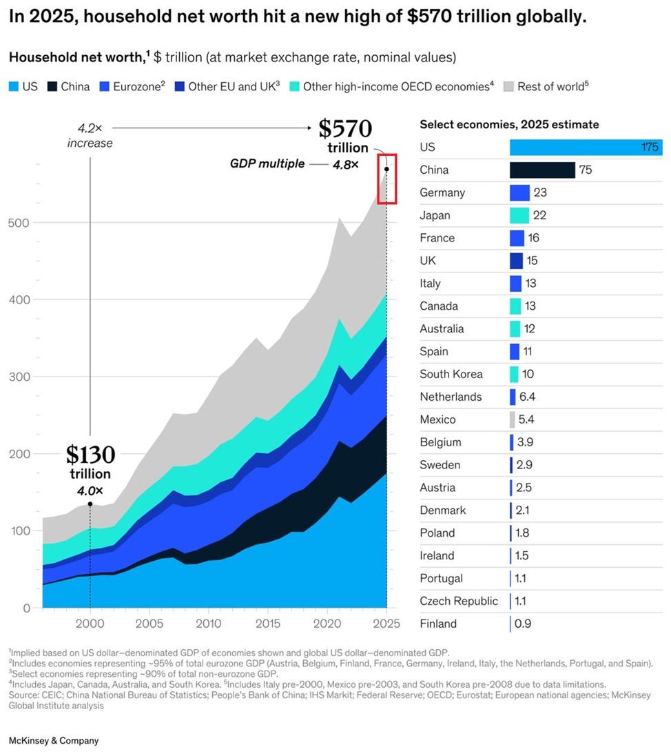
Global household net worth: a record $570 trillion:
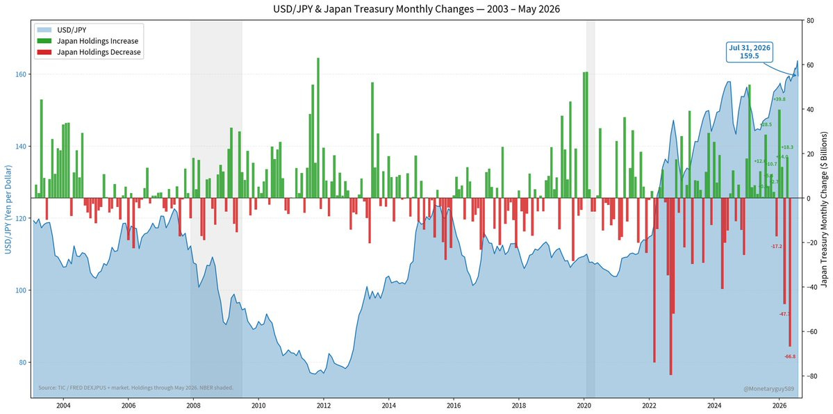
Japan's Treasury holdings vs USD/JPY: -$67B in May:
Total US public debt: $39.89 trillion. Looks sustainable:


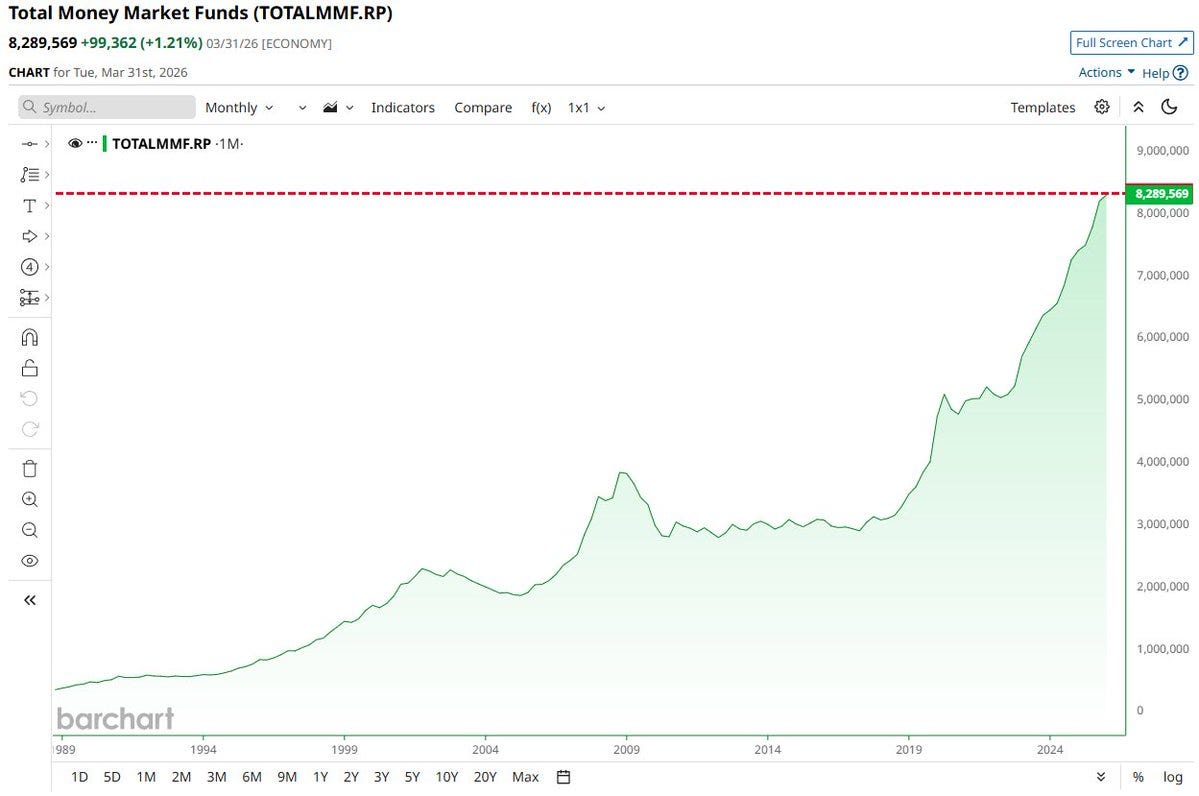
Money market funds at a record $8.29 trillion:
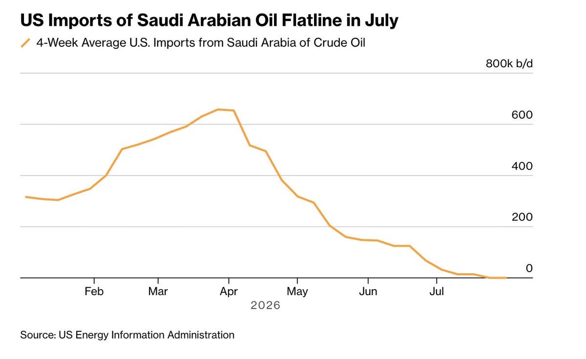
US imports of Saudi crude: 800k b/d to zero, flatline in July:
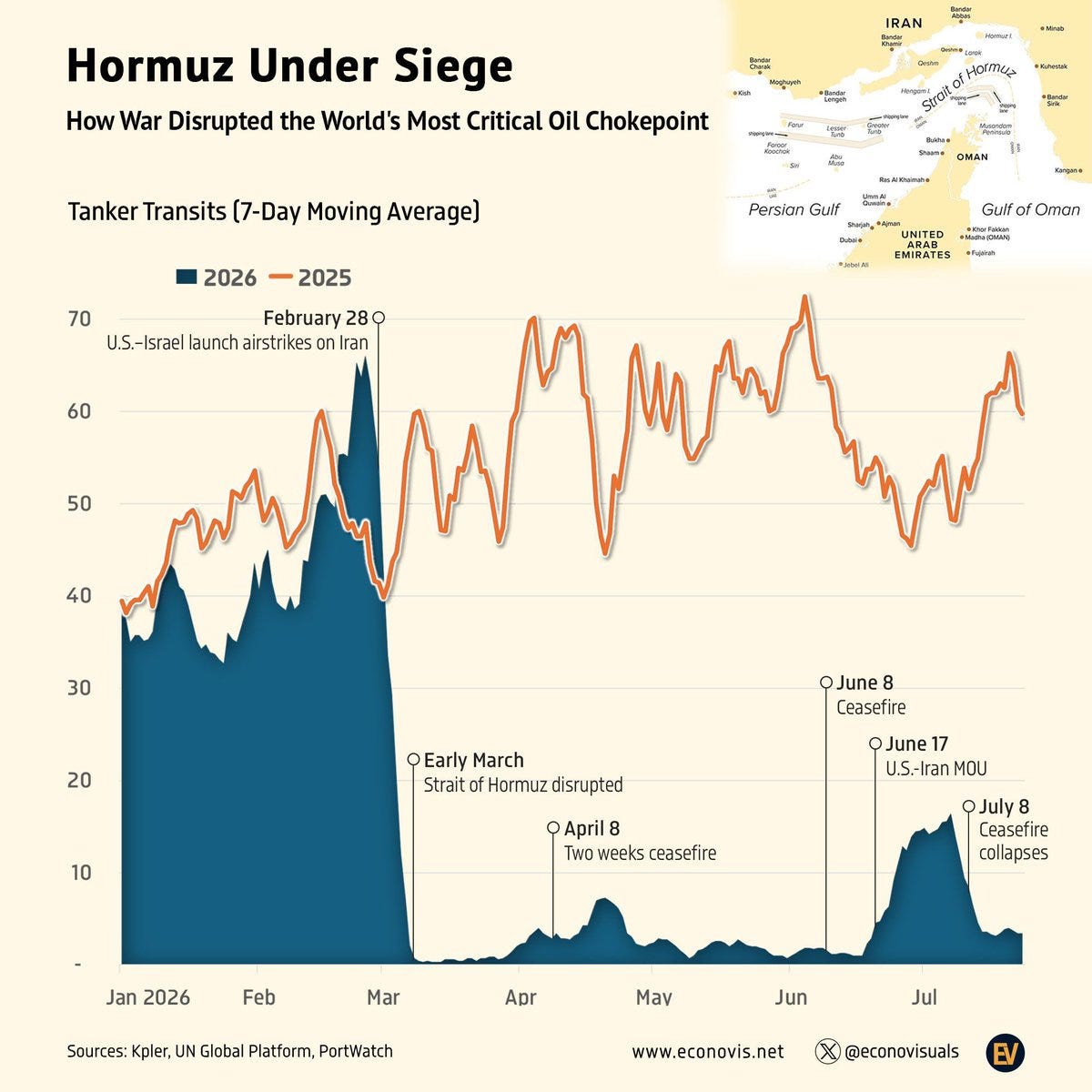
Hormuz tanker transits, 7-day average collapsing:
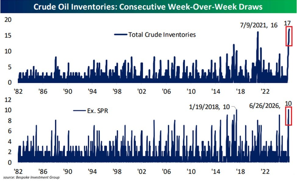
US crude inventories: 17 straight weekly draws, a record:
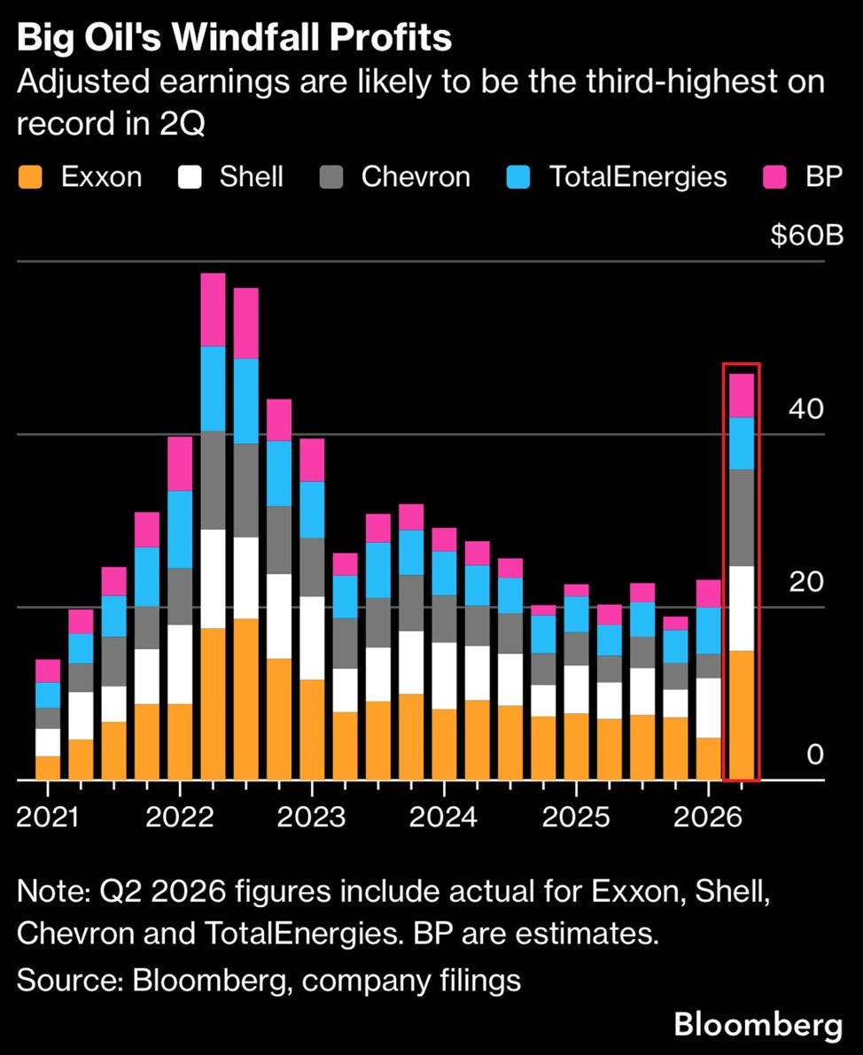
Big Oil's Q2 windfall: ~$44B, third-highest on record (dropping bombs will have something to do with that):
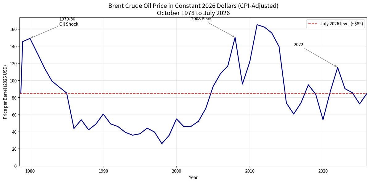
Brent in “constant” 2026 dollars since 1978:
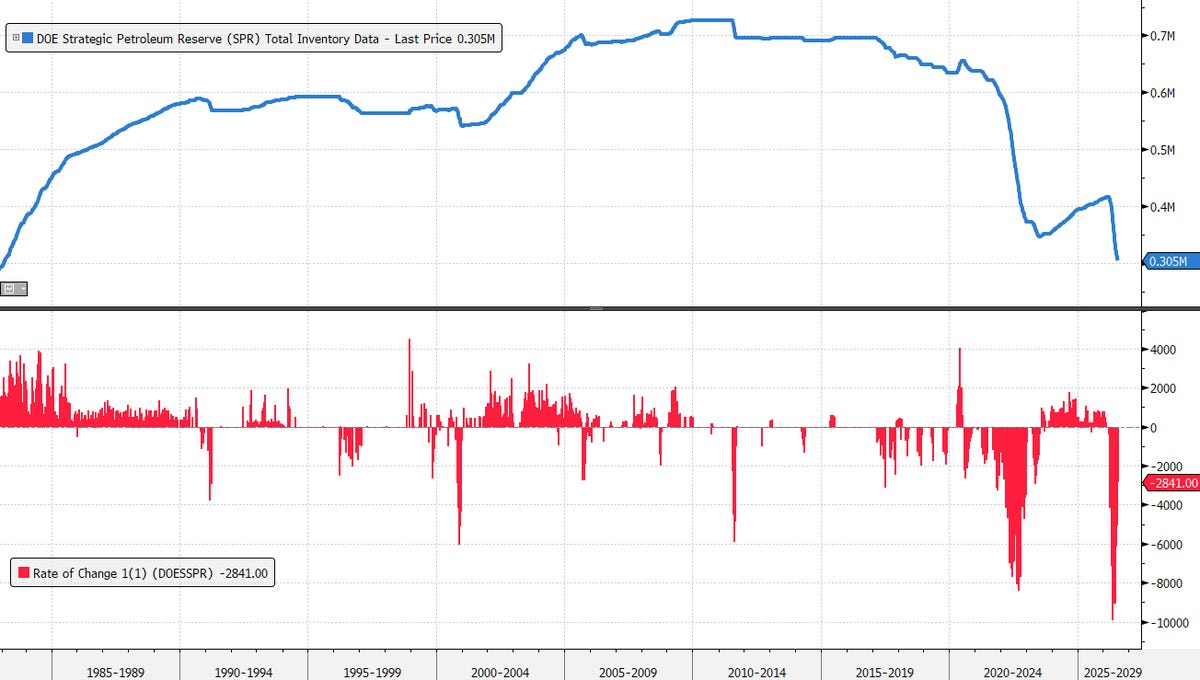
Strategic Petroleum Reserve, lowest since February 1983:
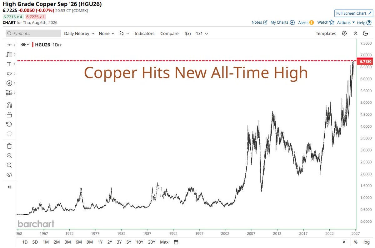
Copper at a new all-time high, $6.72/lb:
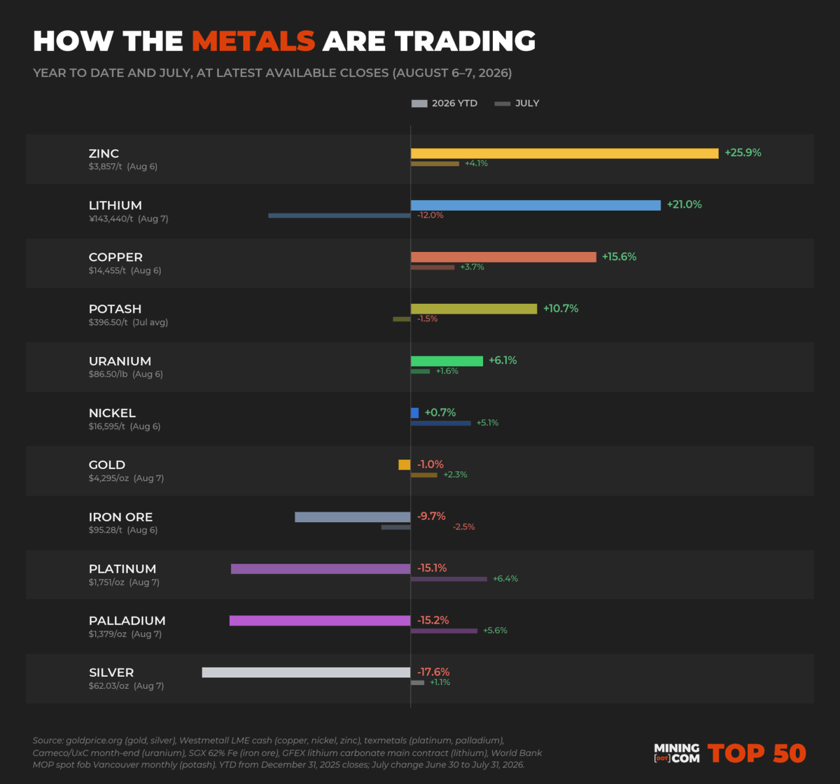
Metals YTD scoreboard: zinc +25.9%, silver +17.5%:
Buffett Indicator at 241%, past the dot-com peak. Nothing to see here:

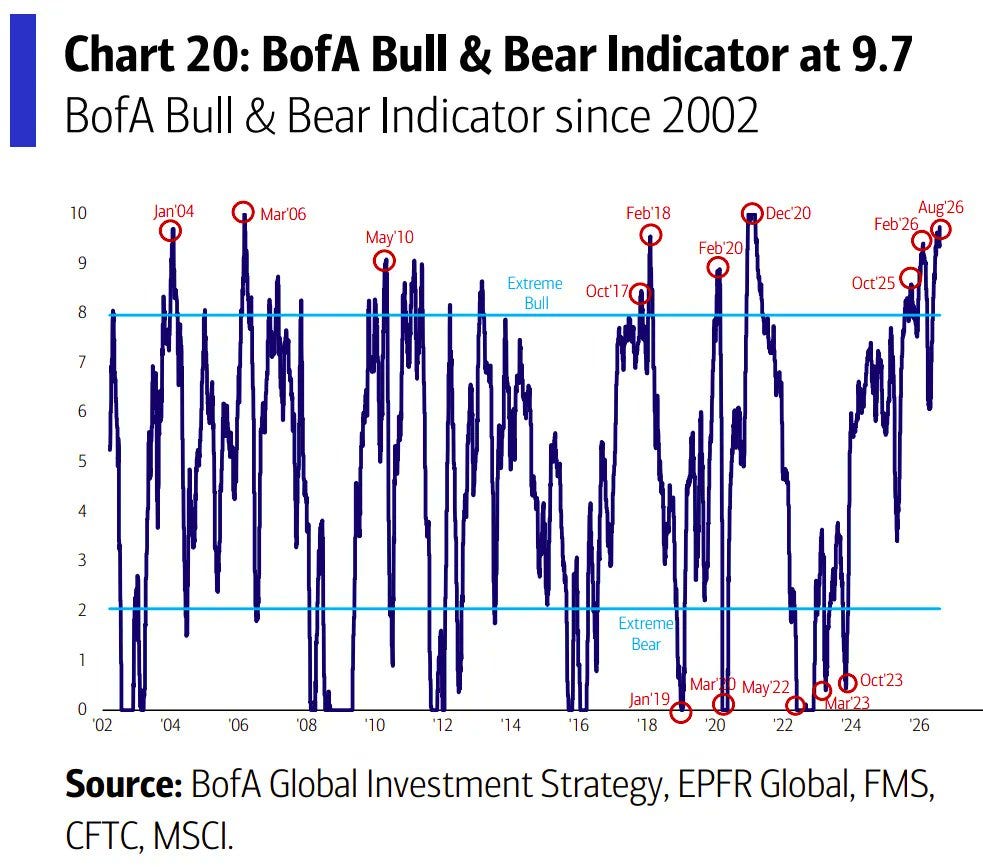
BofA Bull & Bear Indicator at 9.7 — full sell signal:

also that last meme isn't funny. :-)
Sure be nice if the original chart creators would do more data corrections by using real currency values and per capita adjustments (see, for example, x-axis of "G10 debt/GDP vs 30-year yields, Cuckoo-land to the right top") to better put assertions in historical context. I know CPI numbers are manipulated strongly these days, but approximated 'real' values are better than nothing. And, what's with zinc -- do you know? As to mining's continuing low share of capital markets -- there's no post-WWII building boom going on in the West anymore, plus modern so-called 'investors' are all still much bemused by tech la-la land (no pesky EIS's required, among other things).